Cura
An ayurvedic wellness brand looking to refresh its Chyawanprash packaging for a more competitive retail presence
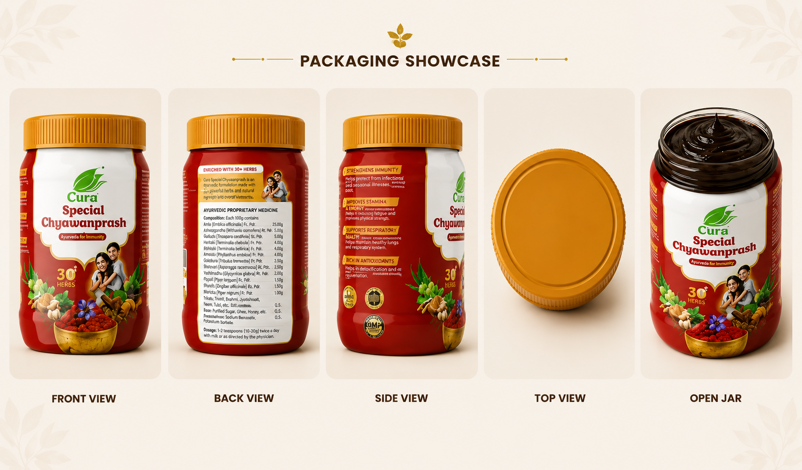
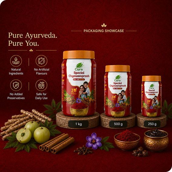
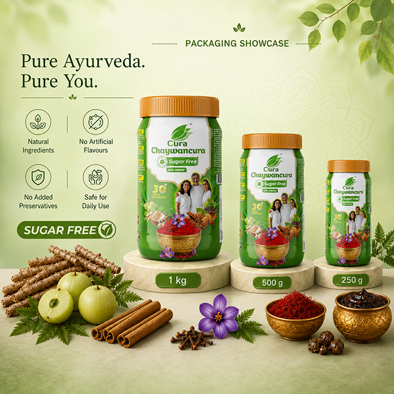
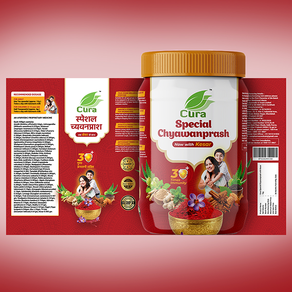
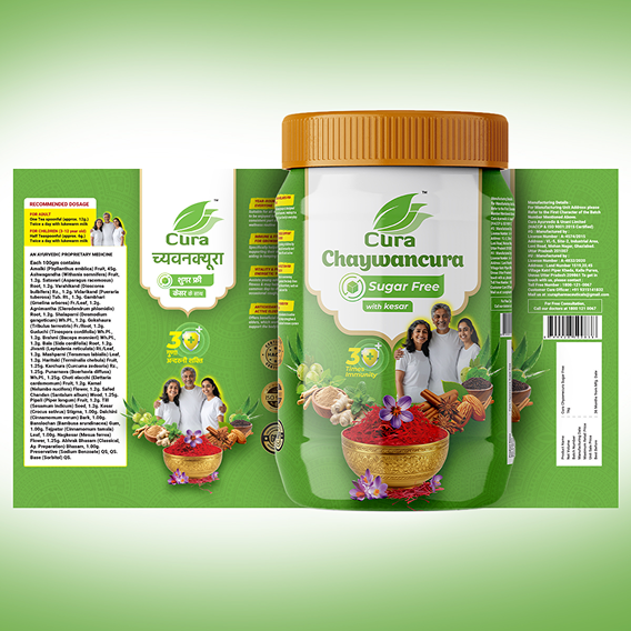
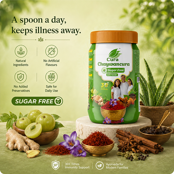
End-to-end packaging redesign focused on improving communication, shelf visibility, and visual hierarchy while staying true to category expectations.
Redesign the packaging for one of the most visually crowded FMCG categories without compromising the familiarity and trust consumers associate with traditional Chyawanprash.
Rather than disrupting the category, we refined it. By simplifying the information architecture, introducing breathing space, and creating a stronger visual hierarchy, we made key ingredients and benefits easier to discover while preserving the cues consumers instinctively trust.
A cleaner, more confident pack that stands out through clarity instead of clutter. The redesign strengthens shelf presence, improves readability, and gives Cura a premium yet familiar identity within the ayurvedic wellness segment.