Vibrant Packaging Design That Energizes a Competitive Market
Client: Trekk, Energy Gel Brand Service: Packaging Design and Brand Identity Objective: To create distinctive packaging that reinforces Trekk’s pioneering position in the energy gel market. Focus: Developing a visual language that connects with athletes, explorers, and everyday achievers. Outcome: A vibrant and cohesive identity that redefined Trekk’s presence as a bold, homegrown performance brand.
Brief
● Trekk was one of the first energy gel brands in India.
● Despite its early presence, the brand needed to refresh its identity to stay relevant in an increasingly competitive market.
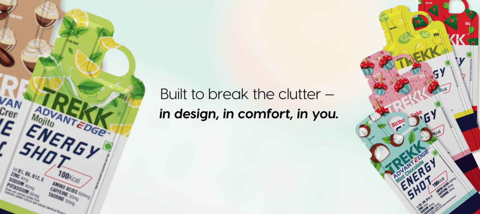
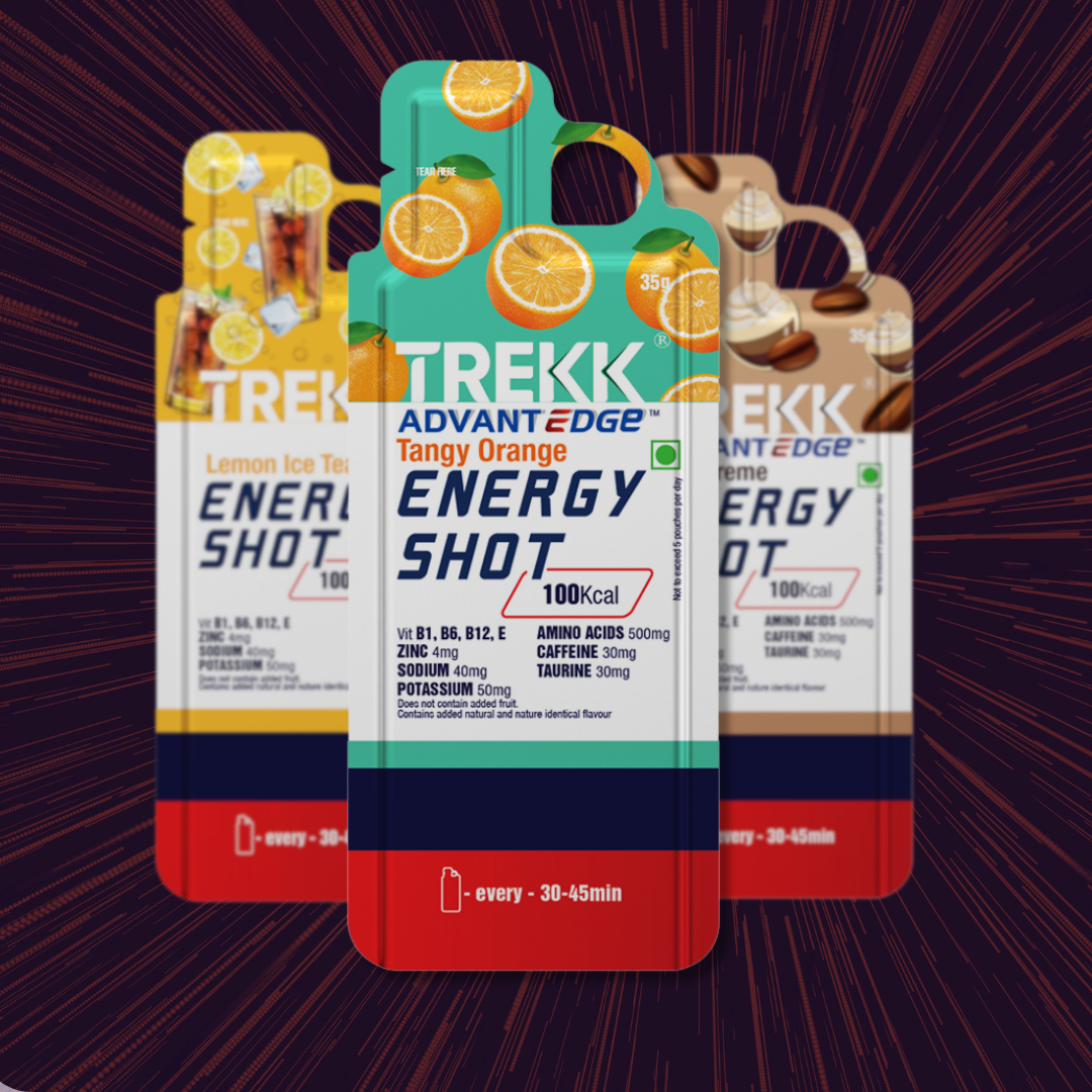
● Kaccha Mango was approached to design packaging for 16 unique gel flavours that would capture energy, endurance, and purpose while enhancing shelf appeal.
Approach & Strategy
● The creative direction focused on combining visual energy with functional design clarity.
● Each flavour was given a distinctive look, supported by a unified brand system to maintain strong consistency.
● Vibrant colour palettes, bold typography, and dynamic layouts were used to express performance and movement.
● The design was crafted to be instantly recognizable, reflecting Trekk’s pioneering spirit and adventurous ethos.
Results
● The new identity gave Trekk a refreshed and confident visual presence in the performance nutrition category.
● The packaging delivered high visibility and strong differentiation across retail and digital platforms.
● The unified design system strengthened brand recognition and consumer connection.
● Trekk continues to be recognized as an authentic, trailblazing brand that inspired the evolution of India’s energy gel market.