Crafting an Architectural Identity Rooted in Earth and Precision
Client: AROFE, Architectural Firm Service: Logo Design & Brand Identity Objective: To visually capture the philosophy of architecture and the essence of nature Creative Focus: Integration of the five elements of nature and five points of architecture Outcome: Distinctive visual identity balancing structure, harmony, and brand essence
Brief
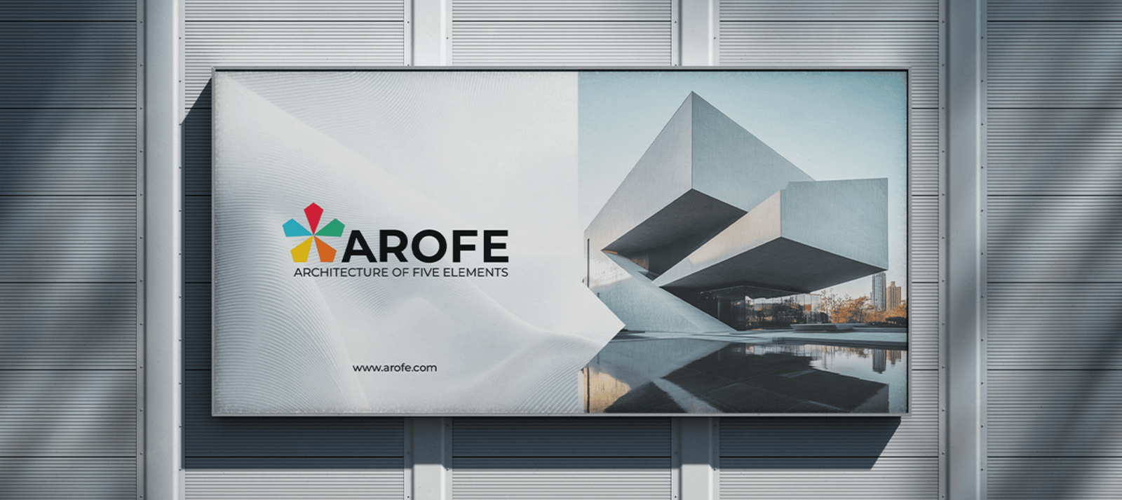
● AROFE approached Kaccha Mango to design a logo that captures their architectural ideology rooted in nature and form.
● The brand sought a visual identity inspired by the five elements of nature and the five points of architecture.
● The goal was to create a structured yet organic logo that represents the firm’s balance between design and environment.
Approach & Strategy
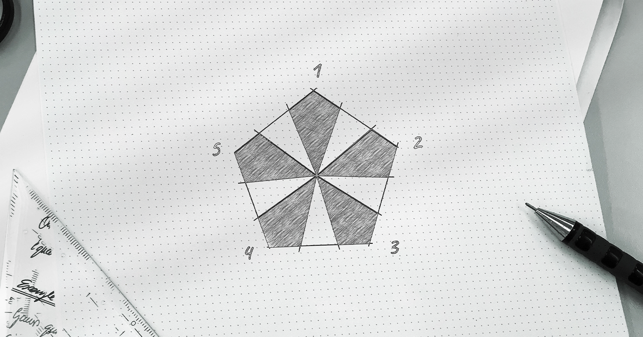
● The team combined architectural geometry with natural symbolism to build a cohesive visual language.
● Each element of nature was translated through color and form to reflect balance and structure.
● The design maintained a sense of precision, proportion, and harmony, mirroring AROFE’s architectural ethos.
Results
● The final logo established a distinctive and timeless brand identity for AROFE.
● It strengthened the brand’s visual presence across print and digital platforms.
● The design positioned AROFE as a contemporary and thoughtful architectural firm with a clear design philosophy.