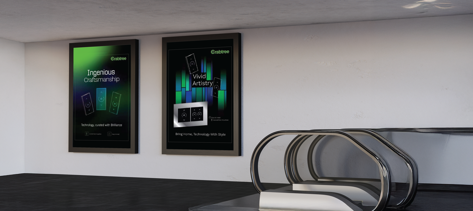
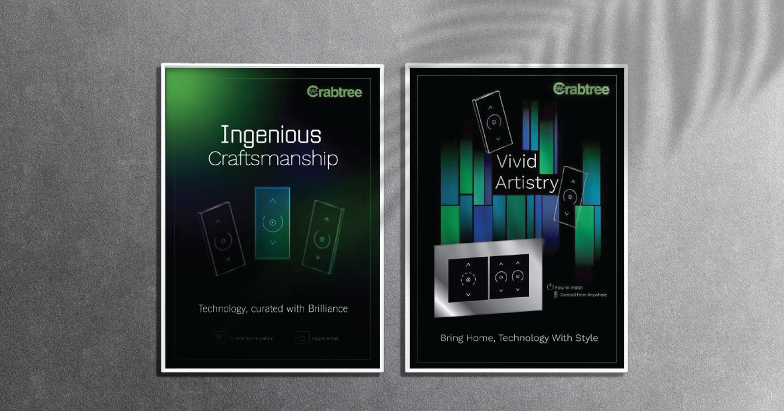
Poster Designs Extending the Language of Premium Simplicity
Client: Crabtree Service: Poster Design Objective: To extend the brand’s premium packaging design language into impactful visual communication. Focus: Showcasing innovation and elegance through minimal design and refined visual consistency. Outcome: A set of sleek, modern posters that reinforced Crabtree’s positioning as a symbol of sophistication and innovation.
Brief
● Crabtree wanted to translate the design aesthetics of its premium touch-switch packaging into a series of posters.
● The goal was to maintain visual harmony while highlighting the product’s innovation and understated luxury.
● The posters needed to capture the idea of the switch as a “silent member of your home,” blending seamlessly into modern interiors.
Approach & Strategy
● The design direction emphasized simplicity, balance, and a sense of quiet elegance.
● Tech-inspired gradients and clean compositions were used to mirror the product’s modern design language.
● Minimal typography and subtle lighting effects created a refined, premium look consistent with Crabtree’s brand ethos.
● The visuals were
Results
● The posters effectively extended Crabtree’s design language beyond packaging into visual storytelling.
● The minimalist approach enhanced brand perception and reinforced the product’s premium identity.
● The campaign highlighted innovation while maintaining a tone of elegance and restraint.
● The final visuals strengthened Crabtree’s position as a brand that defines quiet luxury and modern living.