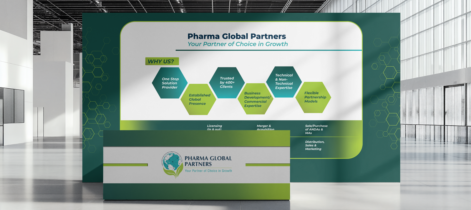
Minimal Exhibition Designs That Communicate Global Credibility
Client: Pharma Global Partners Service: Exhibition Banner Design Objective: To create clean, professional, and impactful banners for global exhibition spaces. Focus: Designing visuals that reflect trust, authority, and clarity within a minimal, elegant framework. Outcome: A cohesive set of banners that elevated brand presence and communicated credibility with simplicity.
Brief
● Pharma Global Partners approached Kaccha Mango to design exhibition banners that would stand out in a crowded professional environment.
● The goal was to create visuals that looked sophisticated yet approachable, projecting the brand’s global stature.
● The design needed to communicate reliability and expertise while maintaining a minimal and timeless aesthetic.
Approach & Strategy
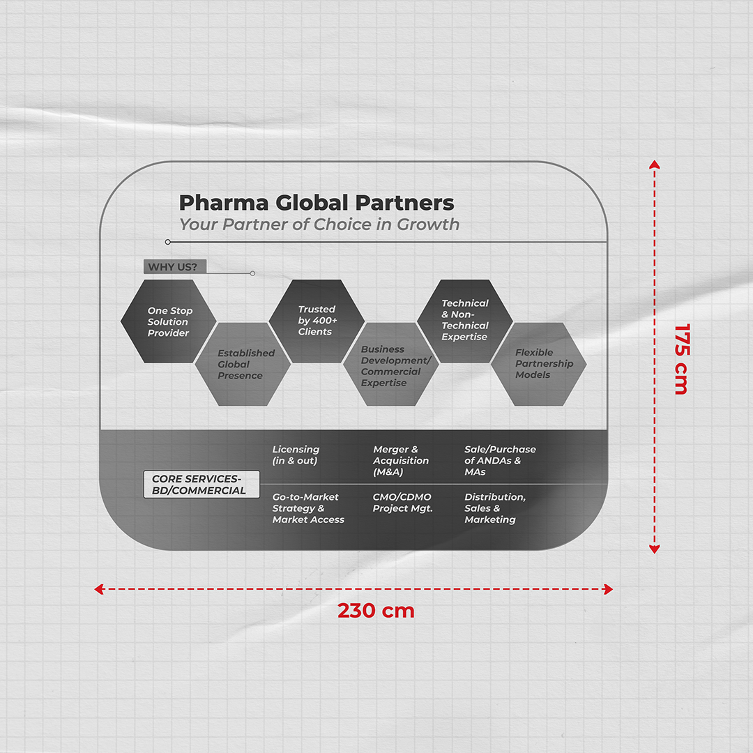
● The creative direction centered on simplicity, precision, and confident visual hierarchy.
● Minimal graphics and clean typography were used to ensure the messaging remained clear and direct.
● The color palette and layout were designed to align with Pharma Global Partners’ established global identity.
● Every design element was refined to create a consistent and professional visual experience across all banners.
Results
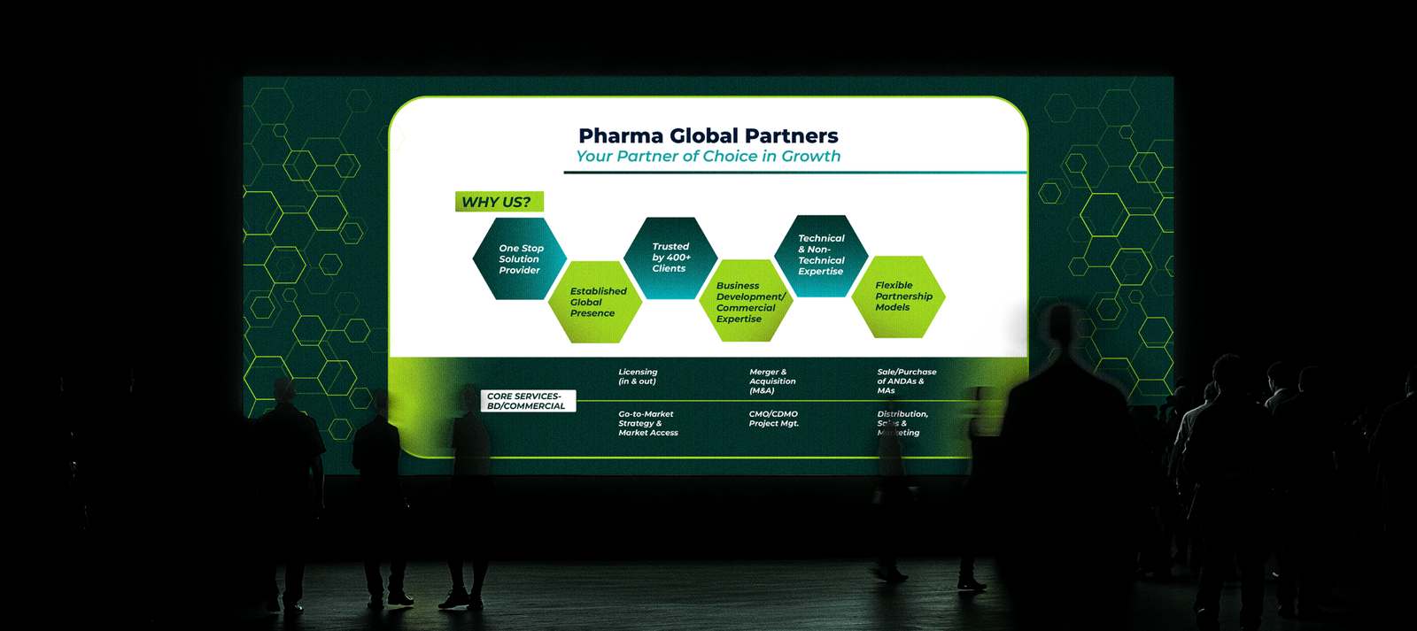
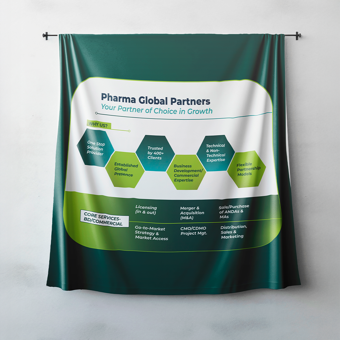
● The final banners delivered strong visual clarity and immediate brand recognition in exhibition settings.
● The minimal design approach enhanced the perception of professionalism and trust.
● The cohesive visual system reinforced Pharma Global Partners’ credibility and authority in the industry.
● The project demonstrated how strategic simplicity can make a brand stand out with confidence and precision.